Tag: Case Study

City Of Melbourne Identity System
City of Melbourne is a dynamic, progressive city, internationally recognized for its diversity, innovation, sustainability, and livability. City of Melbourne council supports the city’s world-class offerings, represents it nationally and internationally, and ensures it remains a preeminent Australian center for culture, arts, dining, entertainment, education, and shopping. Since implementing its previous identity 15 years ago,…

Case Study | Factorie: Making a youth brand young again
The situation In a world where businesses struggle to reach teenagers, Factorie was famous for its youth culture. Unafraid and unapologetic, it resonated with its customers in a way few brands do. So when Factorie’s audience started to grow up, the brand did too. It became a little more mature. Slightly more sensible. Less teenage…

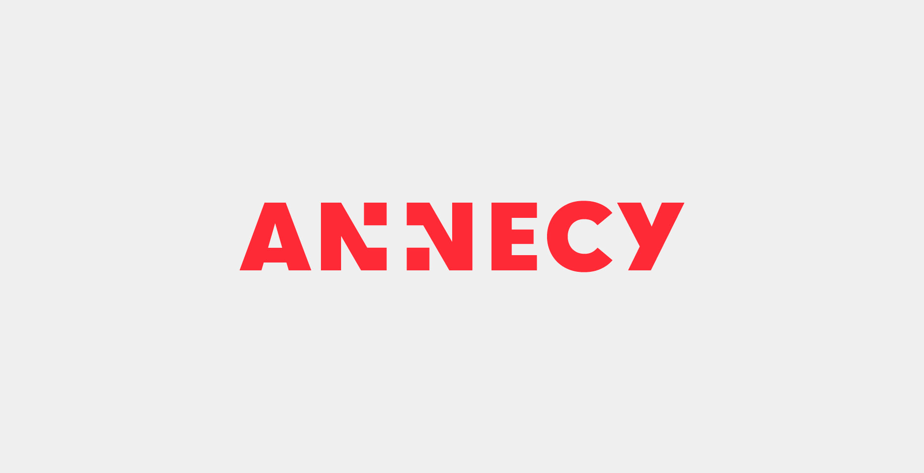
City of Annecy New Brand Design
In June 2016, the municipal councils of the cities of Annecy, Annecy-le-Vieux, Cran-Gevrier, Meythet, Pringy and Seynod voted the creation of the new city of “Annecy”, that officially came into being on January 1st 2017. It is in this context that Graphéine took part in the project, by designing the new city’s visual identity. The…

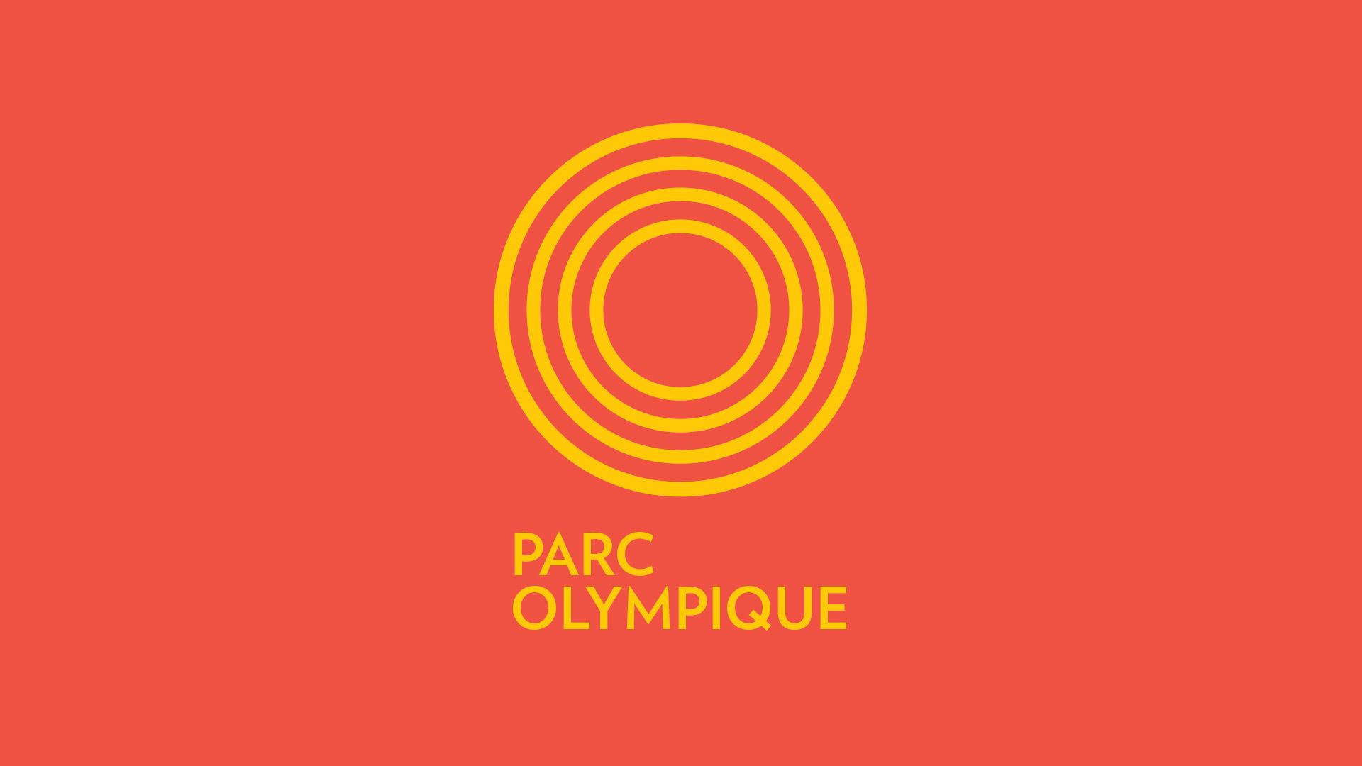
Parc Olympique de Montréal : la revitalisation de la marque par lg2
Stade Olympique : Le logo s’inspire à la fois des pistes d’athlétisme et de l’anneau circulaire du stade, l’icône la plus reconnaissable de Montréal.

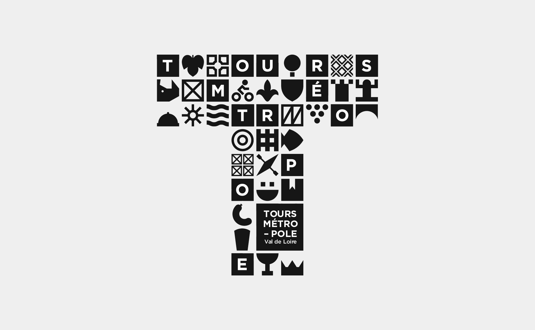
City Branding : Tours Métropole Identity
Several months ago, Graphéine, a branding agency created in 2002 and based in France, was consulted to propose a visual identity project for Tours Métropole. This is the unused project they designed. We found it very smart and well designed, so we wanted to share it with you on Only Graphic Design. We hope you…

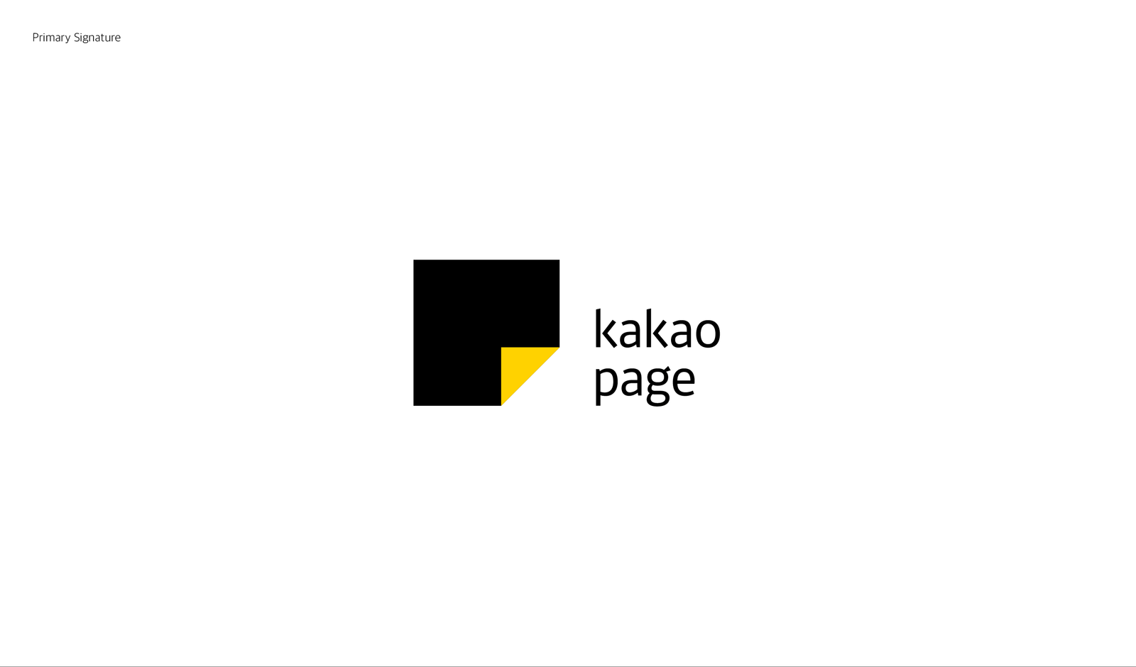
Kakaopage Brand Experience Design Renewal
Kakaopage is a content platform service that provides extensive contents, such as comics, general books, VOD services and more, from diverse categories. Like readers who memorize their favorite pages by turning down the corner of the pages, the symbol that seems like dog-eared page on a square platform means Kakaopage where you can find your own…

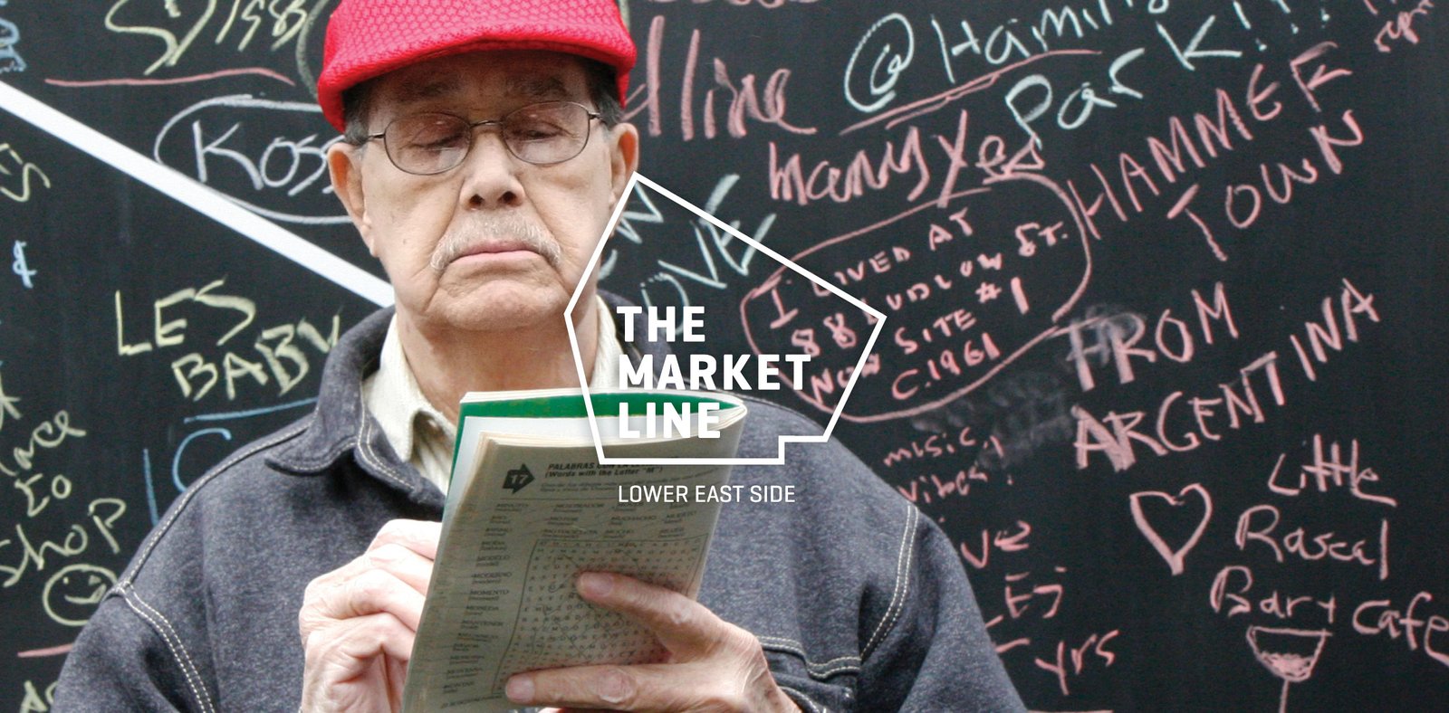
Case Study: The Market Line Identity Branding
Prove the Authenticity of a New Place Delancey Street Associates had a bold vision for the former SPURA site in the heart of the Lower East Side (LES). 10 buildings, 1.9 million square feet of residential, commercial, and retail space. It’s main artery was a new marketplace: The Market Line. The brand needed to prove…