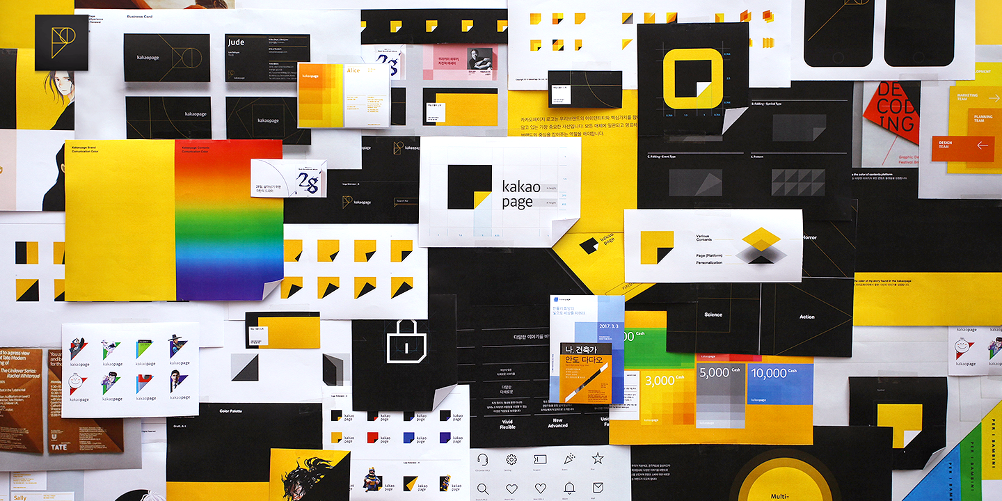
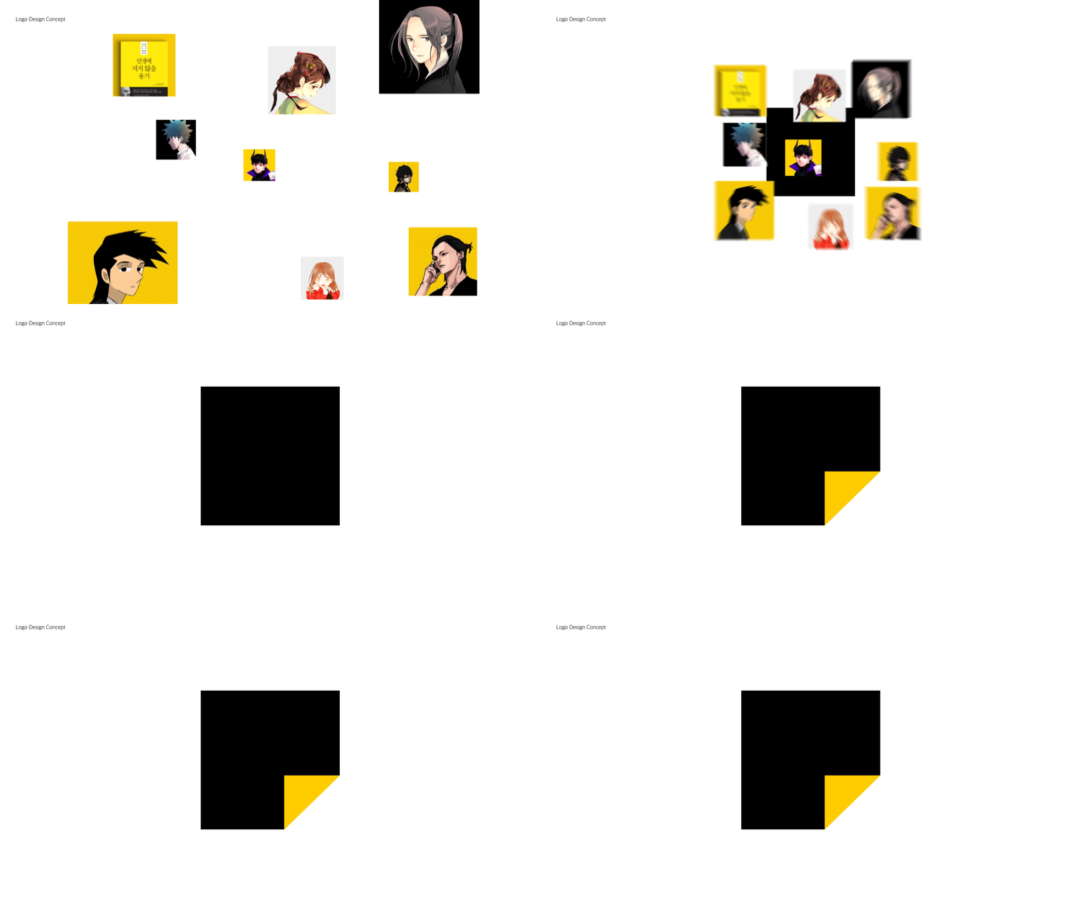
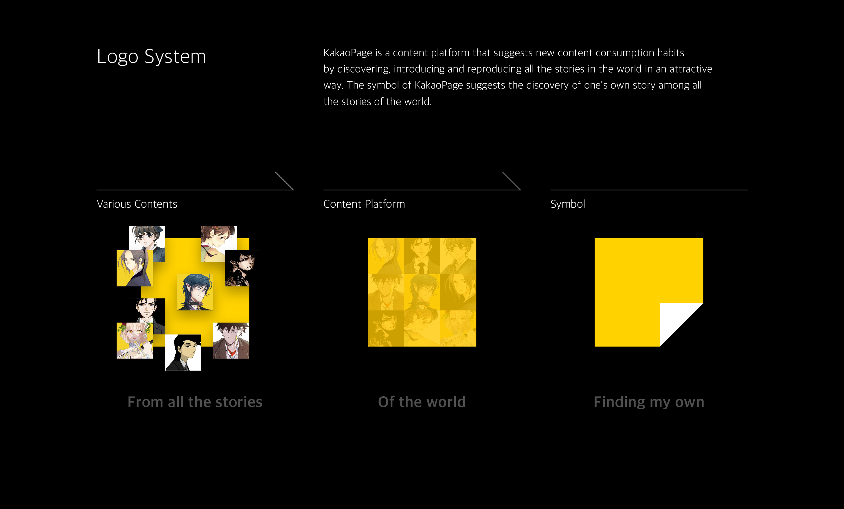
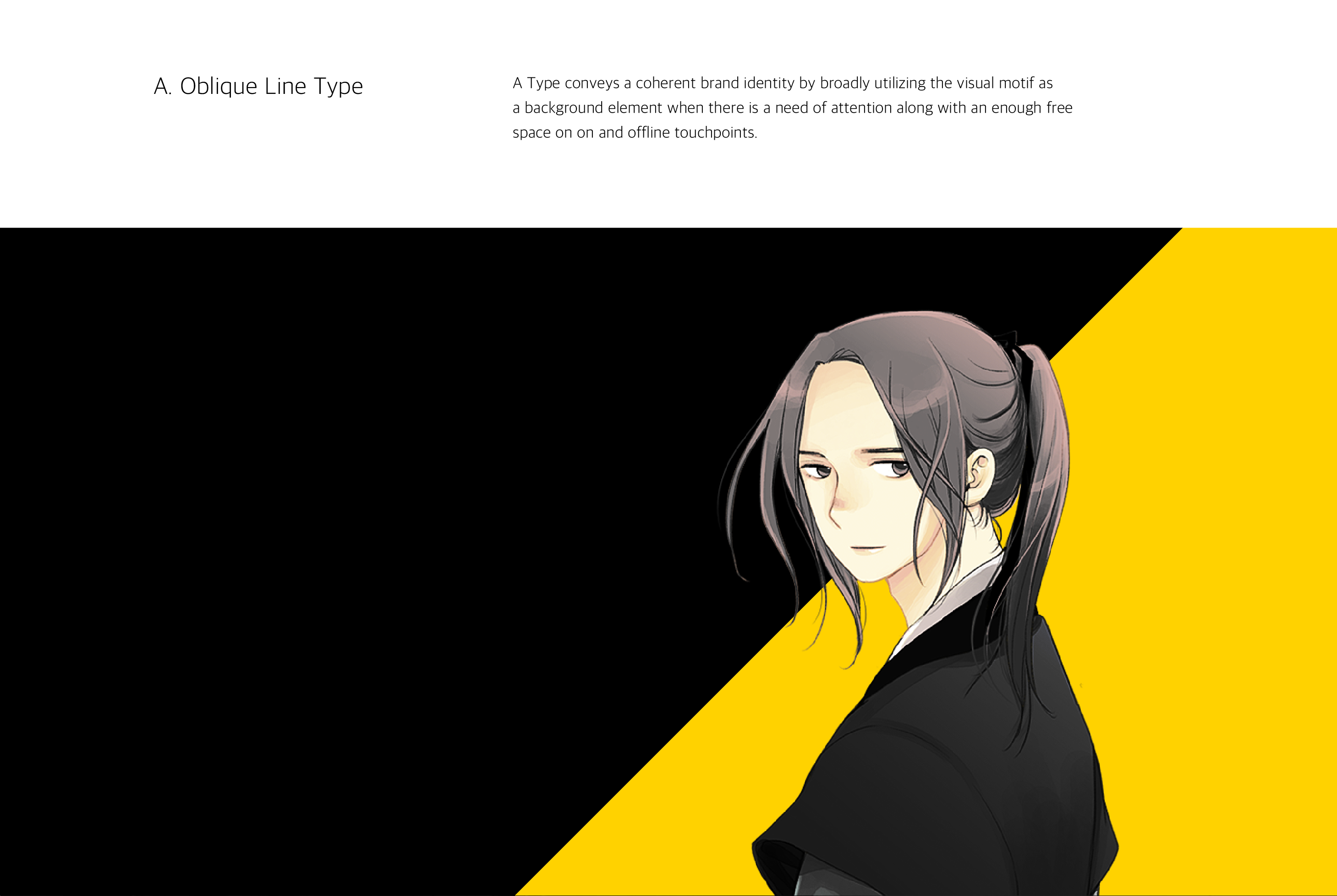
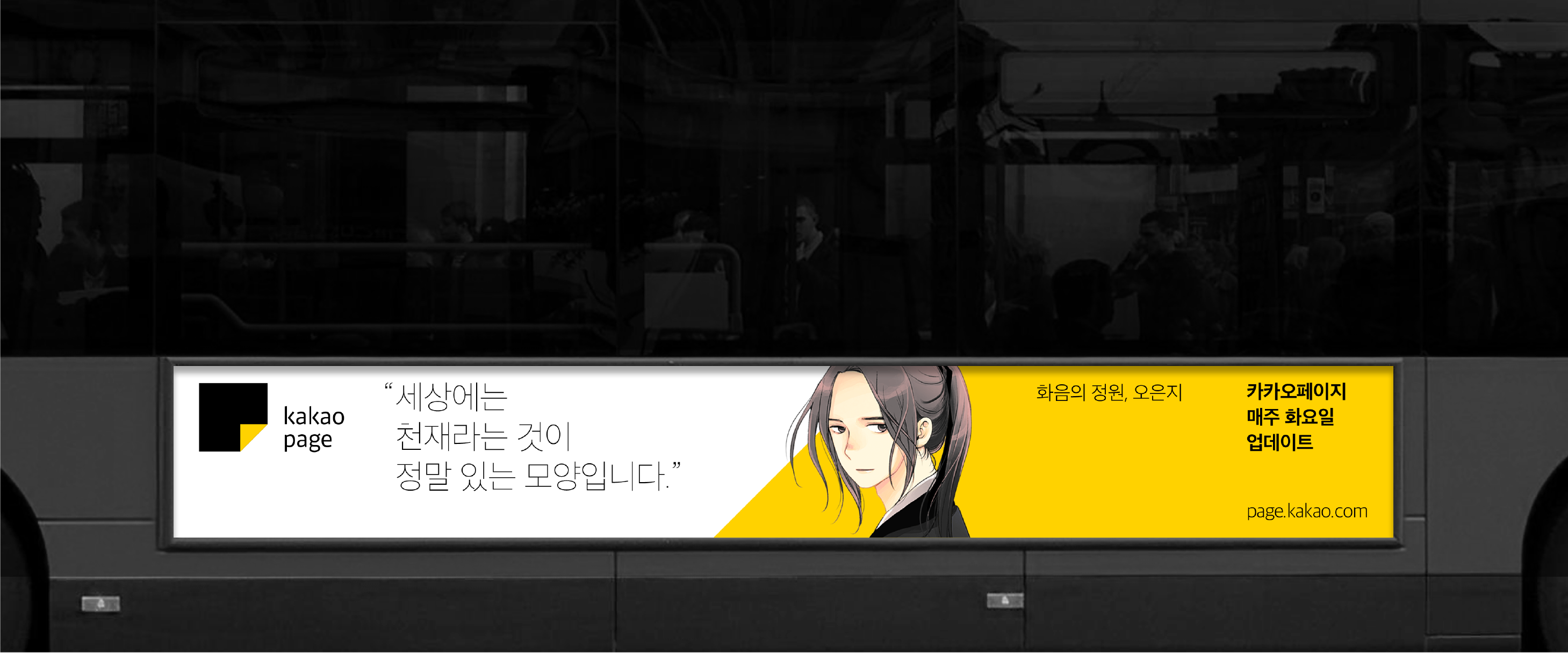
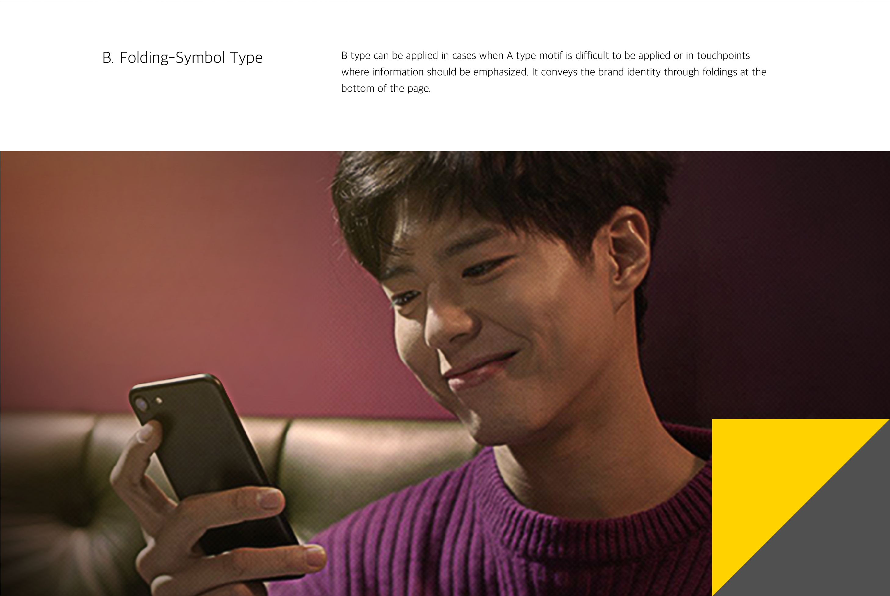
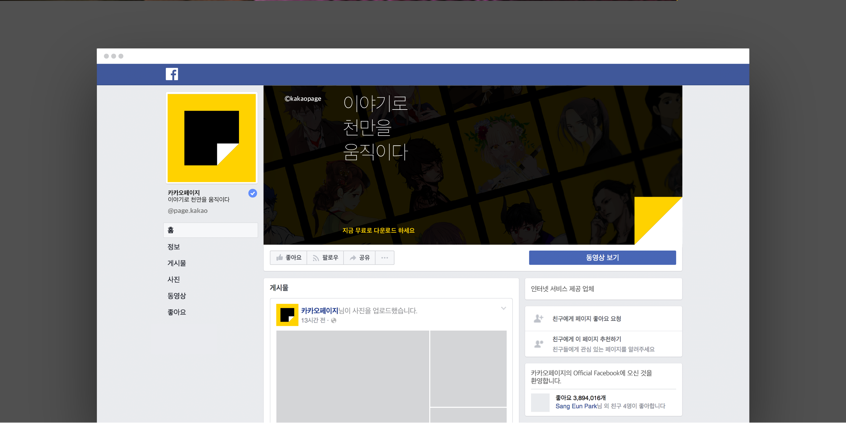
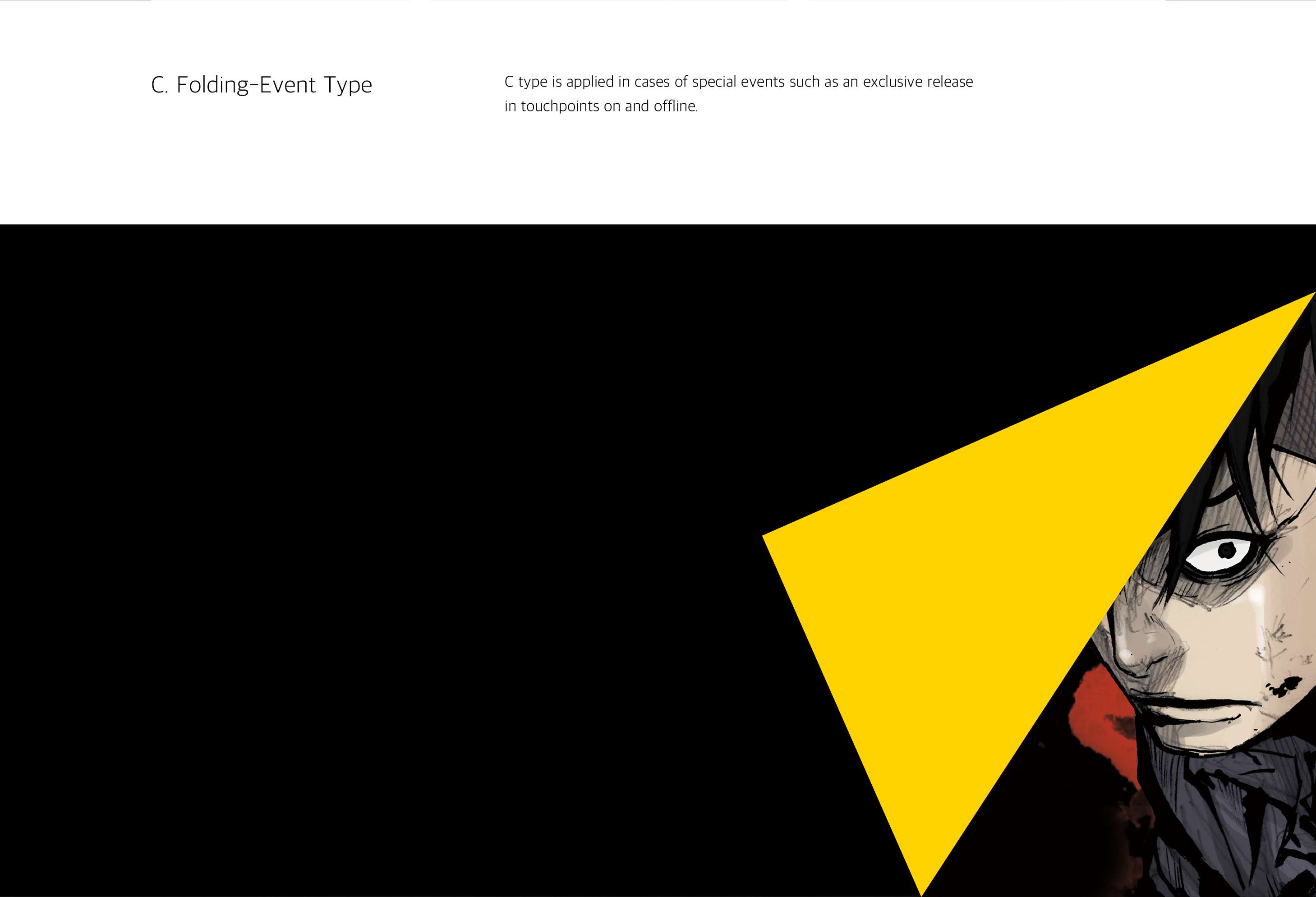
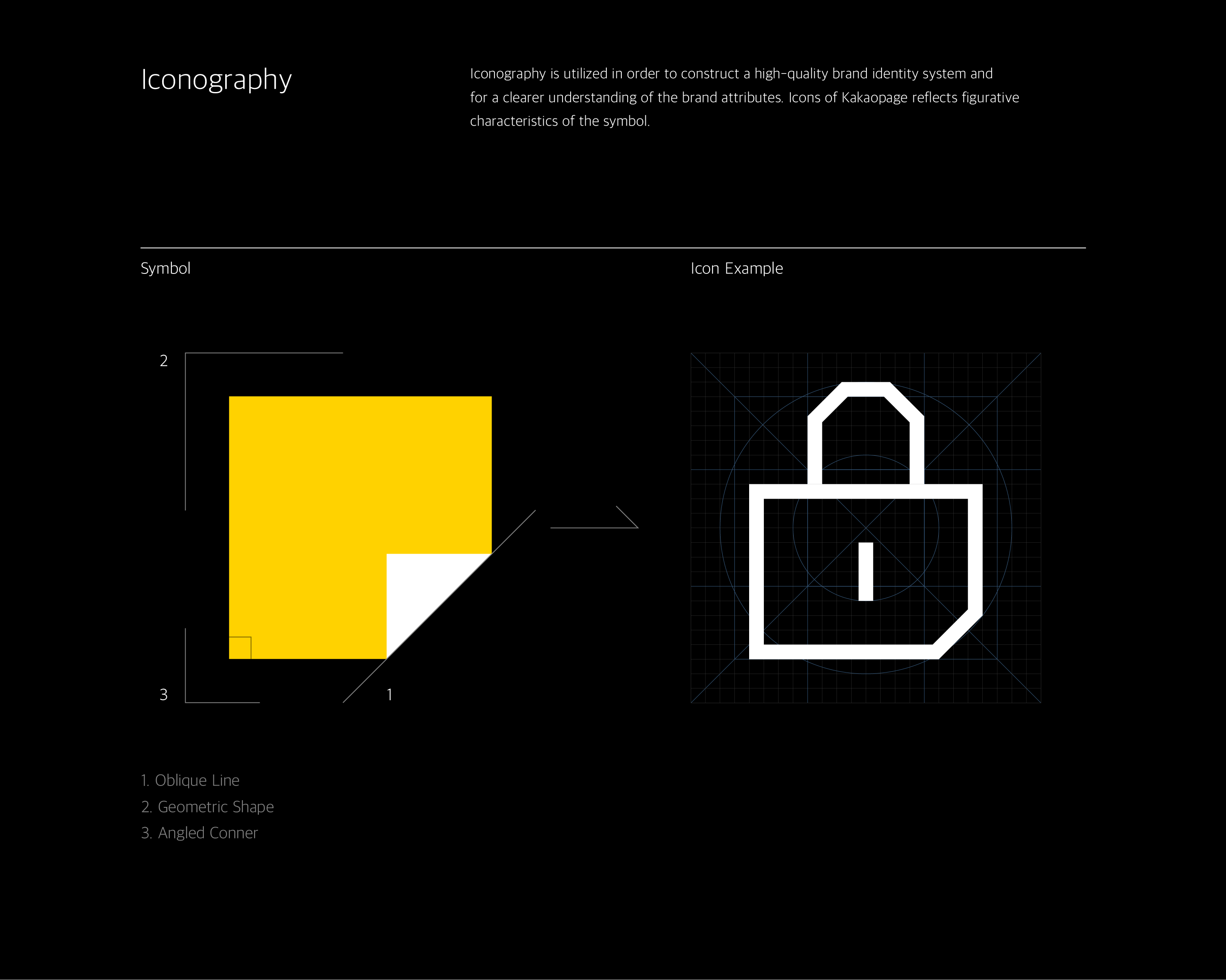
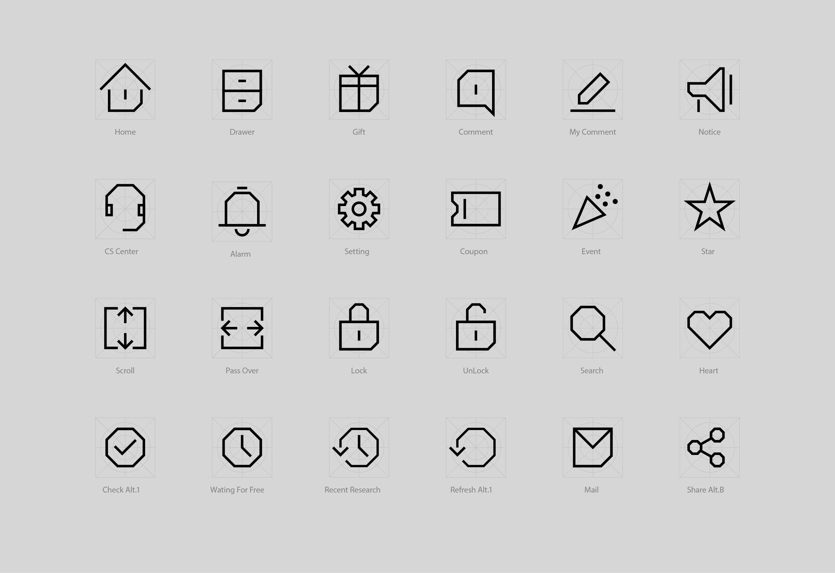
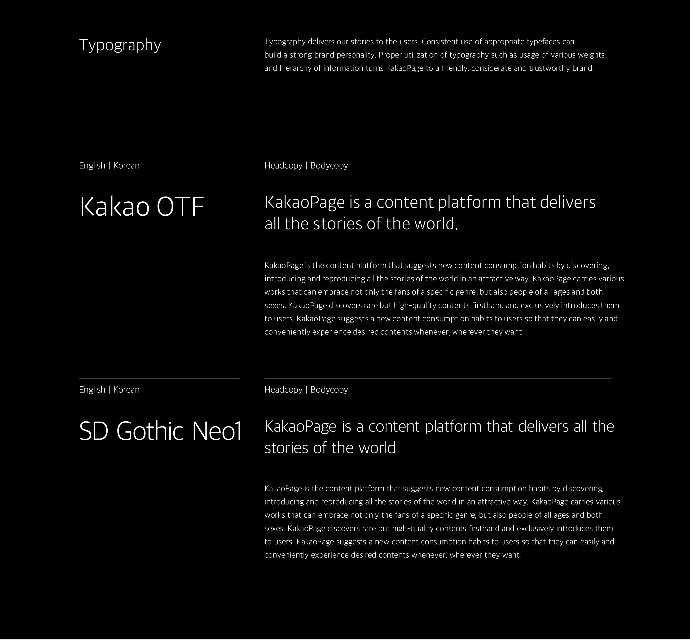
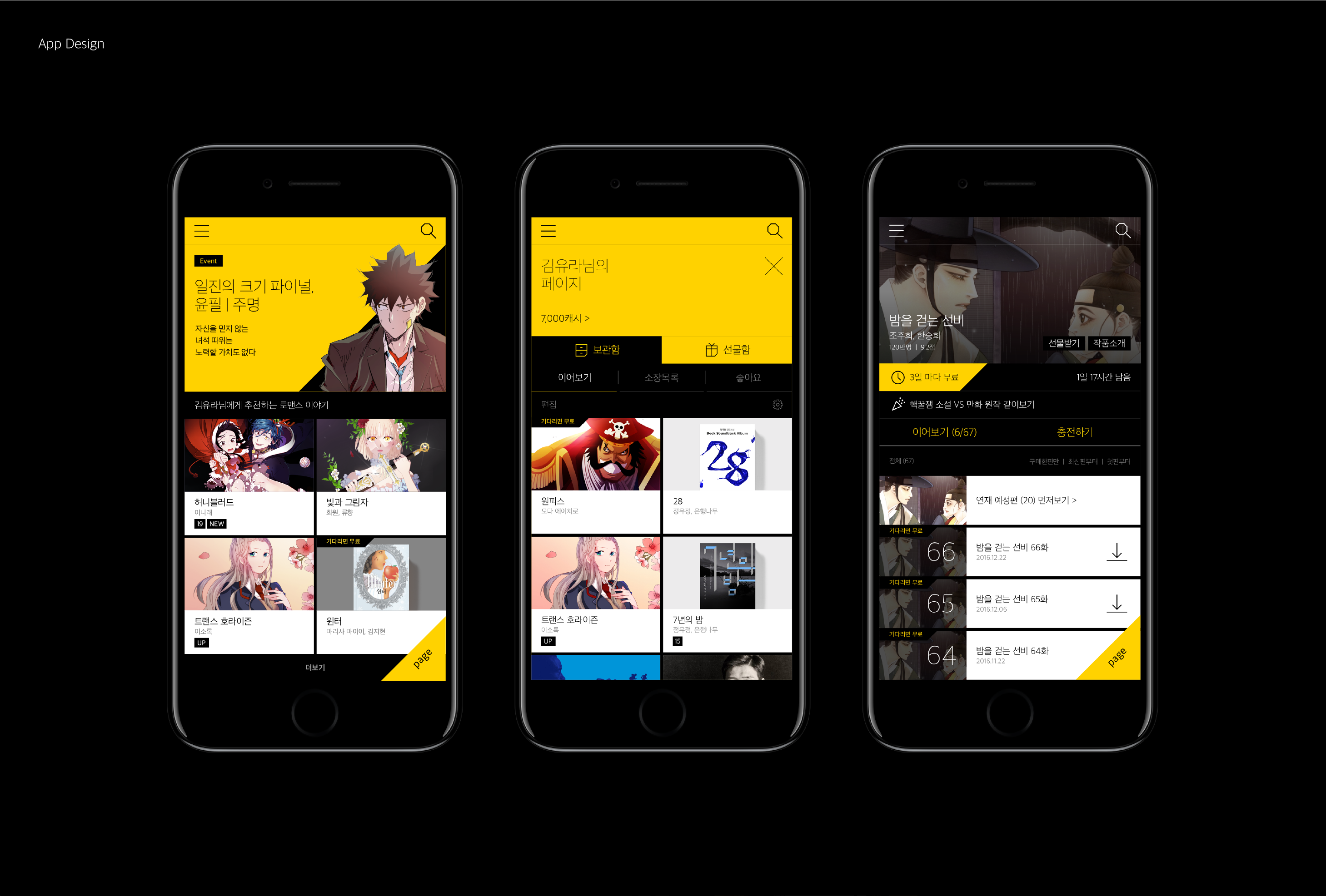
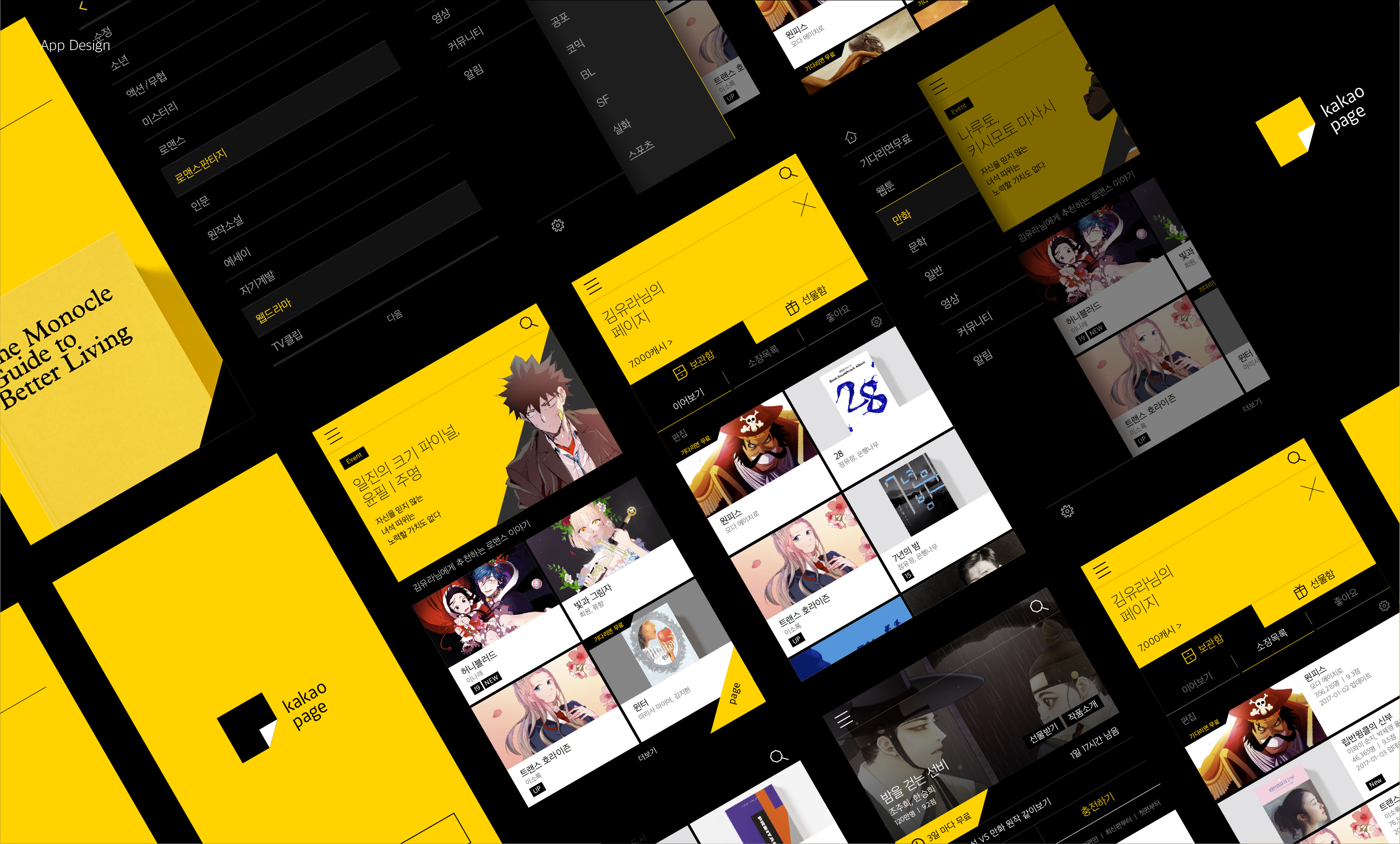
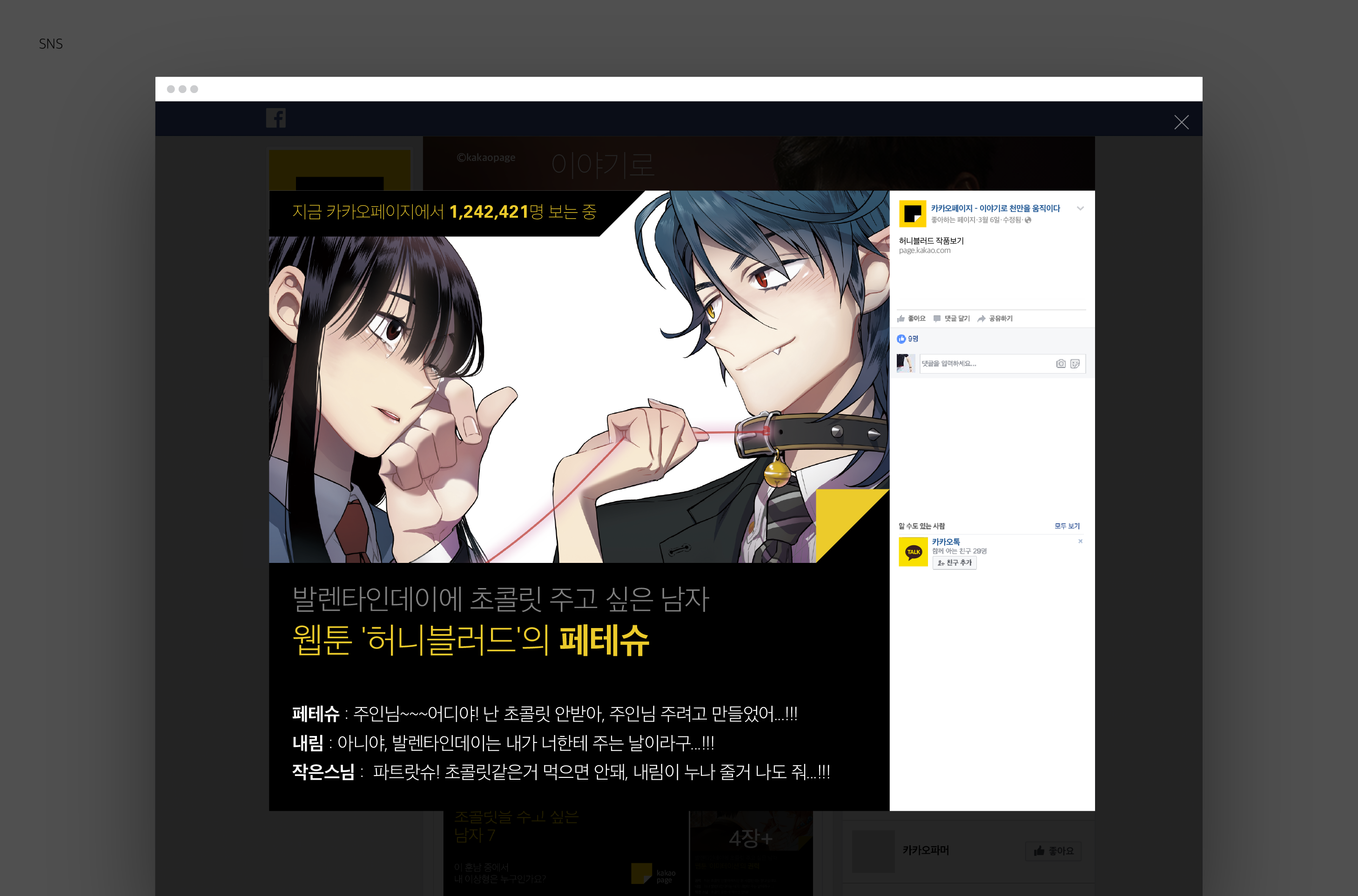
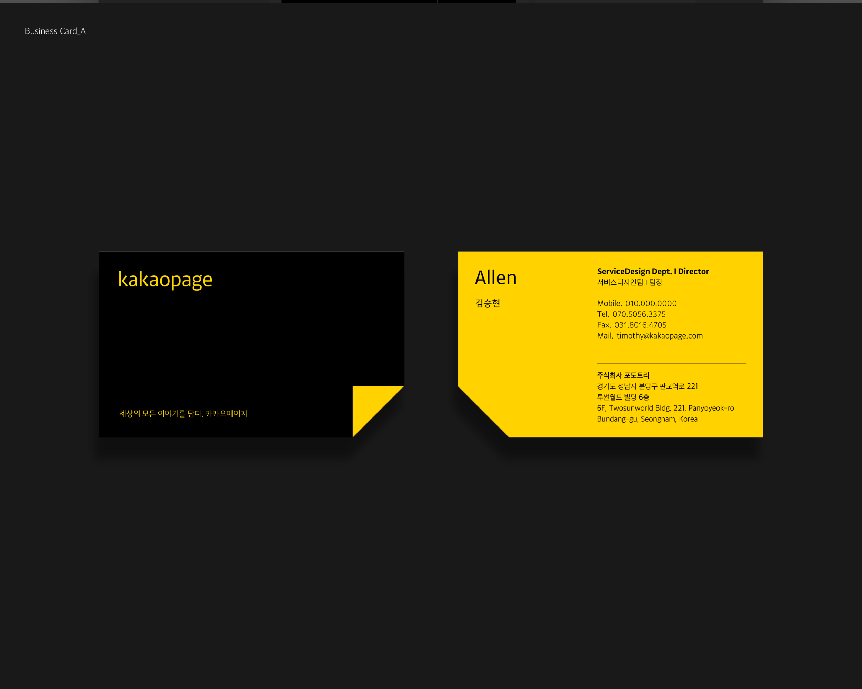
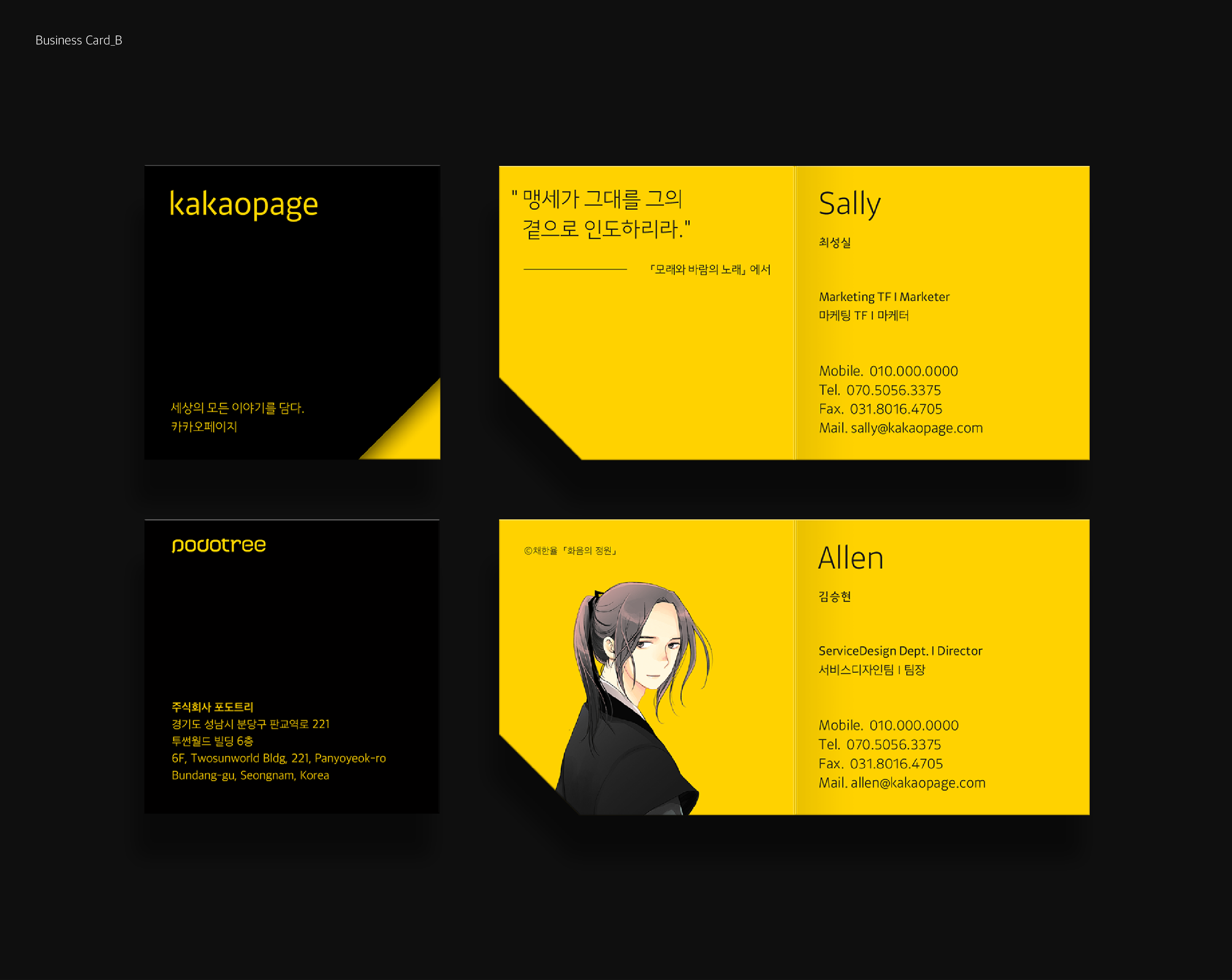
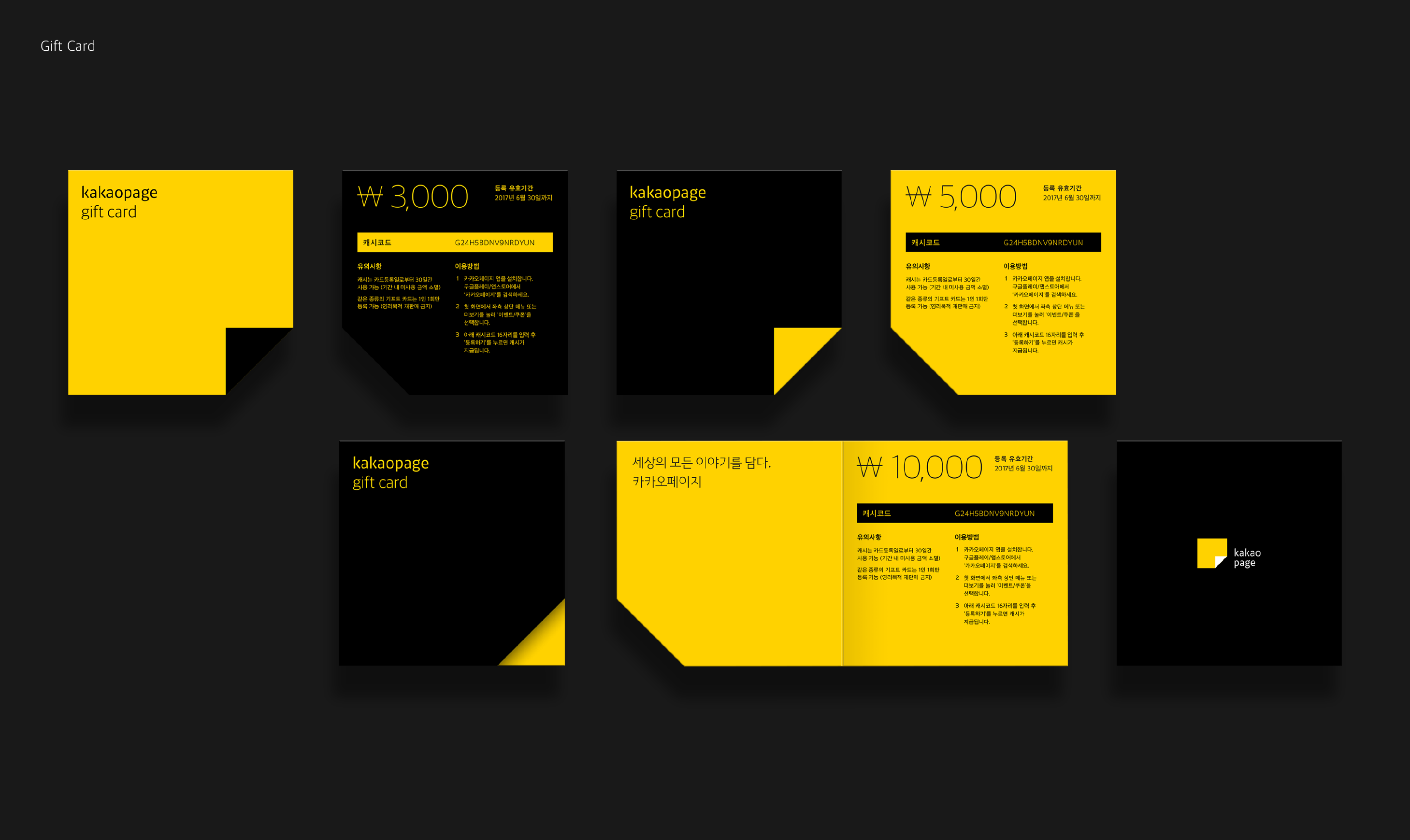
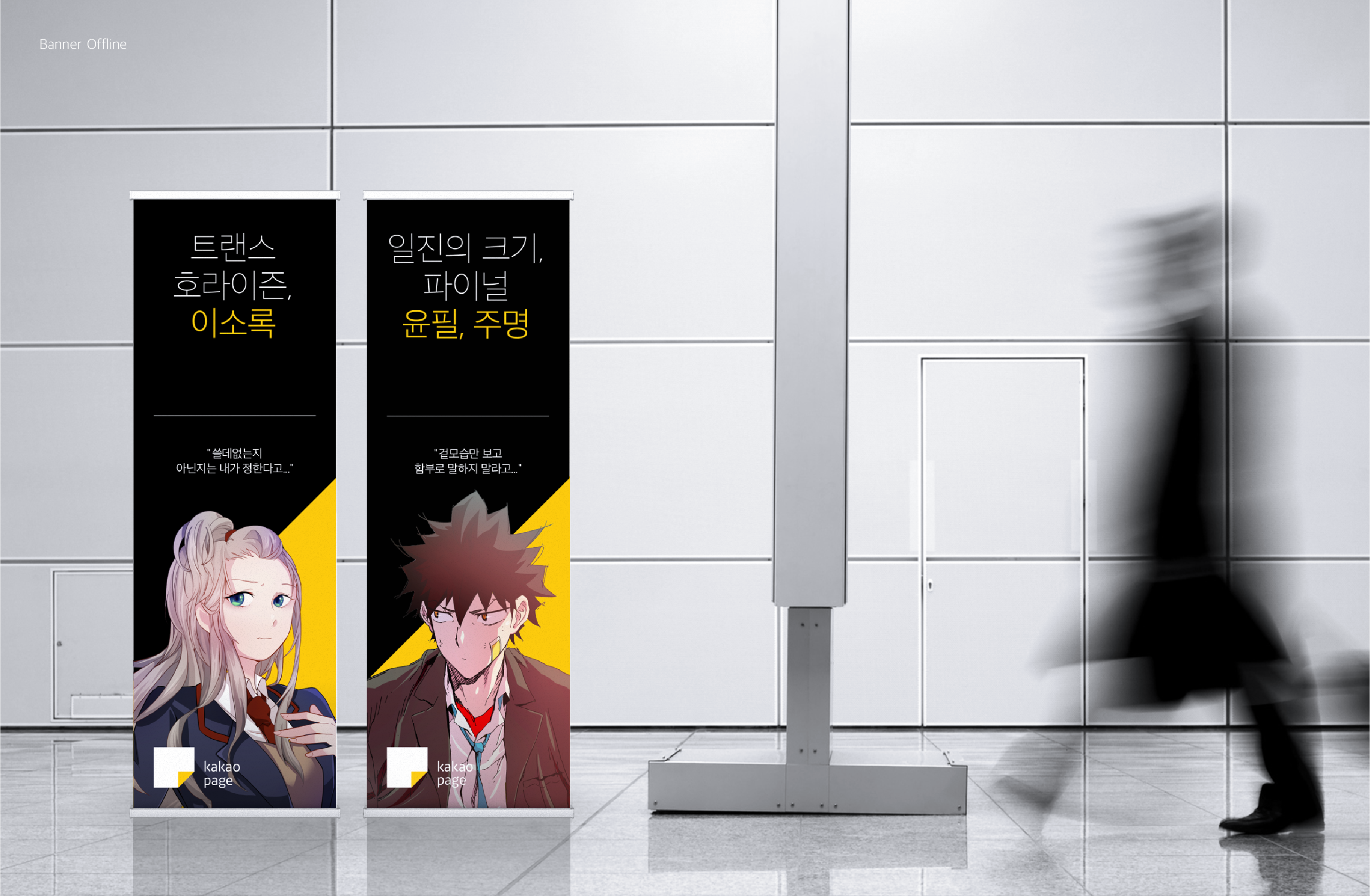
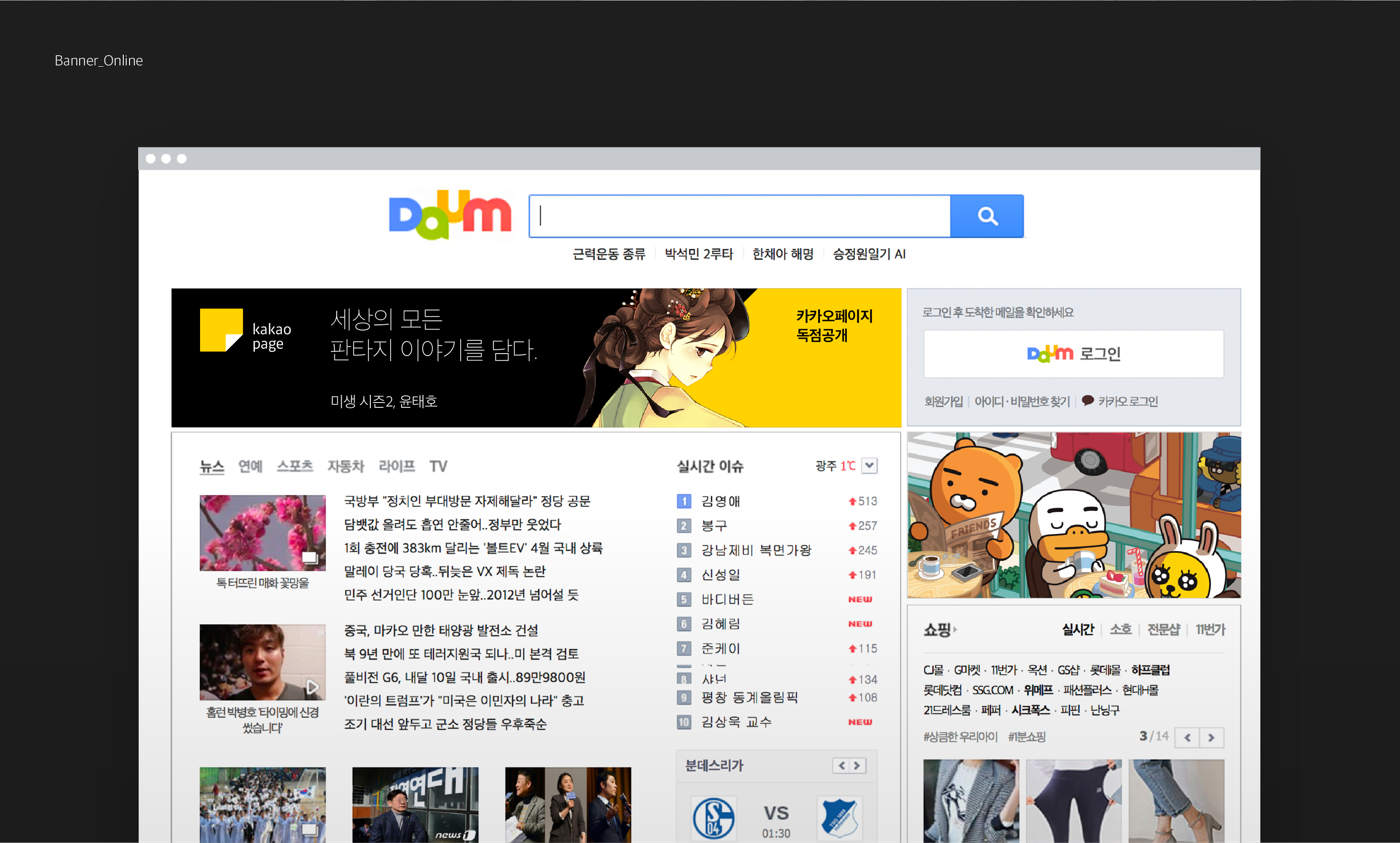
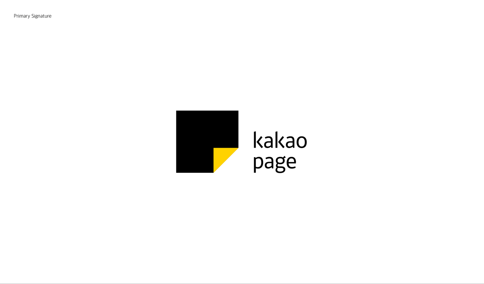
Kakaopage is a content platform service that provides extensive contents, such as comics, general books, VOD services and more, from diverse categories. Like readers who memorize their favorite pages by turning down the corner of the pages, the symbol that seems like dog-eared page on a square platform means Kakaopage where you can find your own story among various stories. The symbol means not just analog behavior but also behavior that readers turn over the pages on digital devices. Through this, PlusX, an brand experience marketing & design agency from Seoul, South Korea, wanted to express the story platform Kakaopage that has every stories from analog contents to digital contents of the world, and curates all those stories that people love. By developing its own visual motif, typography and icon, PlusX constructed a highly refined brand identity of Kakaopage. PlusX applied those elements to various touch points on and offline to provide a unique and coherent brand experience. Here you are the complete case study of this amazing design renewal!













Leave a Reply