Category: Packaging

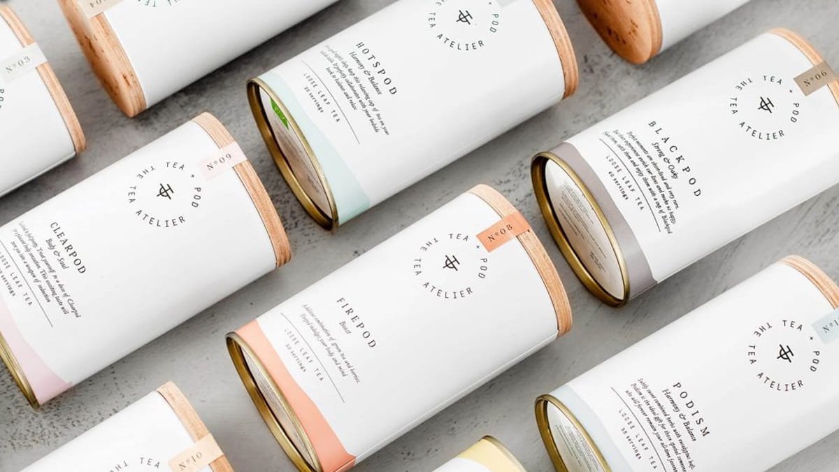
Teapod – The Tea Atelier
Studio Born set out to create a minimalist, Japanese-inspired tea brand with a symbolic logomark and soft color palette.

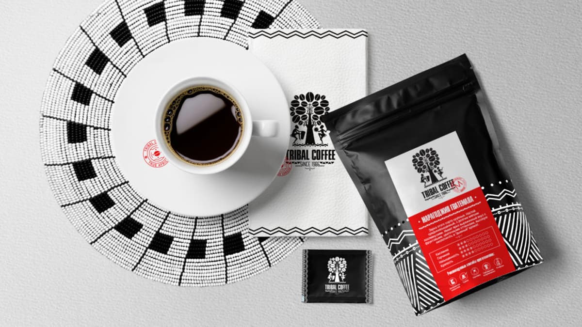
Identity And Packaging Design For Tribal Coffee
In general the identity has a strong ethnic line in a modern presentation, that makes it extraordinary individual and stylish.

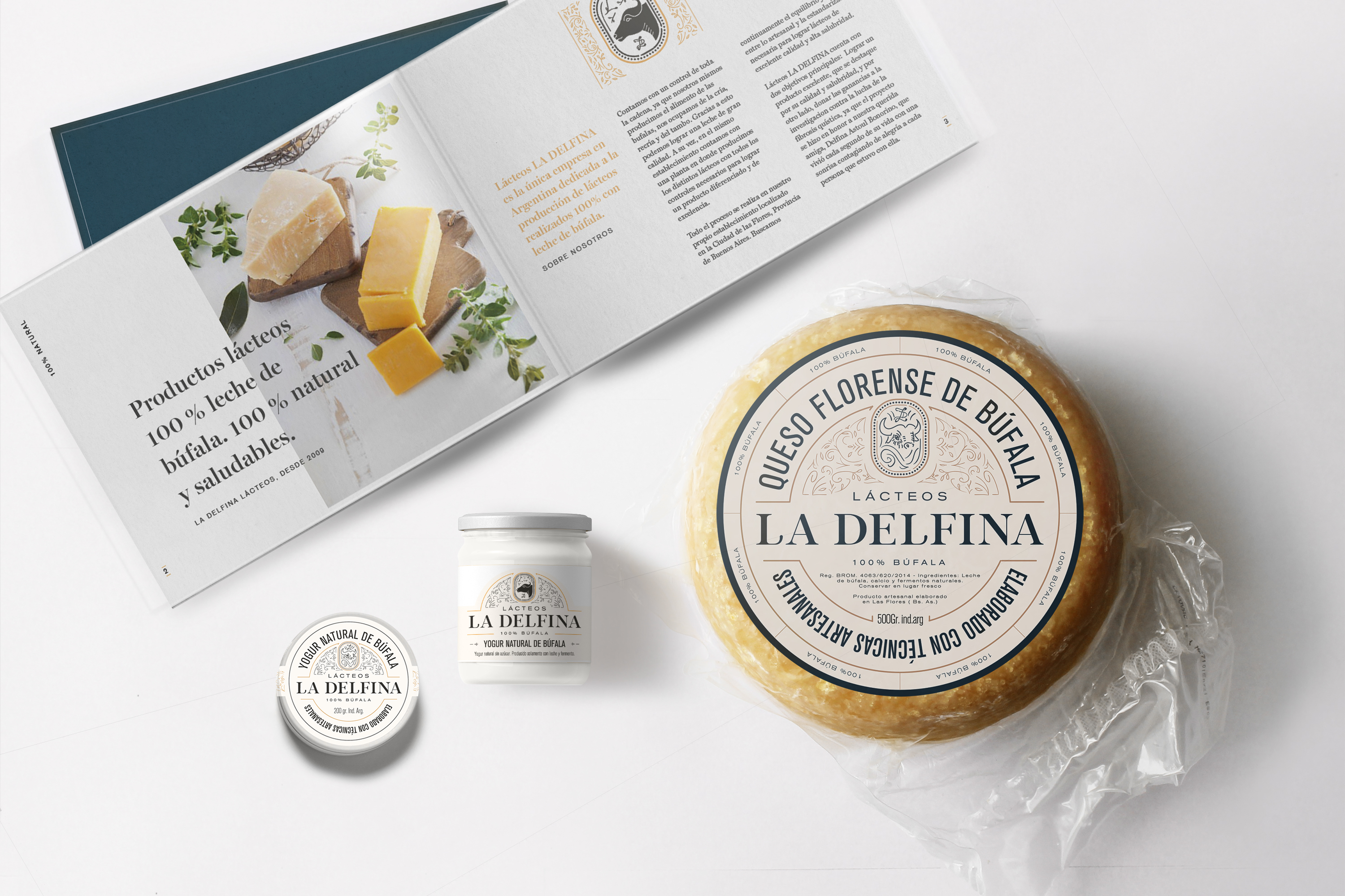
La Delfina Identity
Lácteos La Delfina is a unique company in Argentina dedicated to the production of milk products made 100% with buffalo milk. They really take care of buffalos thus increasing quality production. They are in control of the whole chain, since they even produce the food buffalos eat. They do treat them with love… they even…

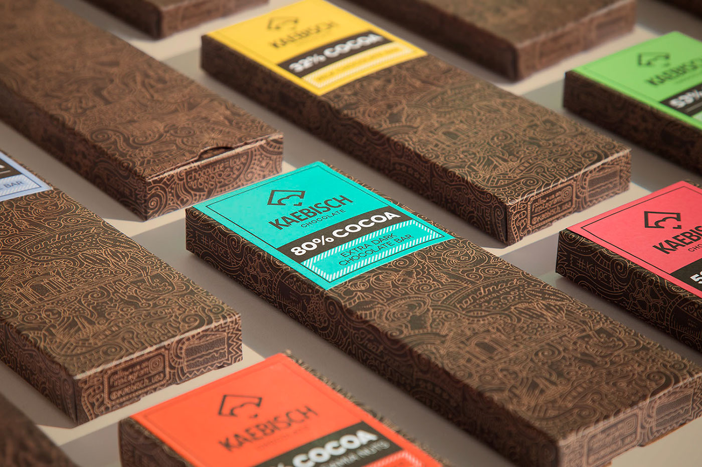
Kaebisch Chocolate Packaging
Mauro Martins is a Brazilian former Art Director. His last position in Ad Agencies was as a Senior Creative at Crispin Porter + Bogusky headquarters in Boulder, CO – USA. On late 2015, he decided to move back to Brazil to figure out an independent way to work and make cool stuff by his own.…

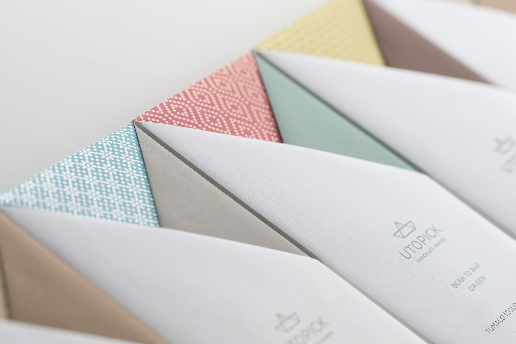
Utopick Chocolates Corporate Identity, Packaging & Chocolate Bar
Paco Llopis is a master chocolatier. An ingenious craftsman constantly searching for new discoveries in flavors, textures and filling techniques in the world of “bean-to-bar”- an artisanal craft produced entirely under the makers control, in this case, using selected cocoa pods bought directly from local producers in Colombia and other Latin American countries. He came…

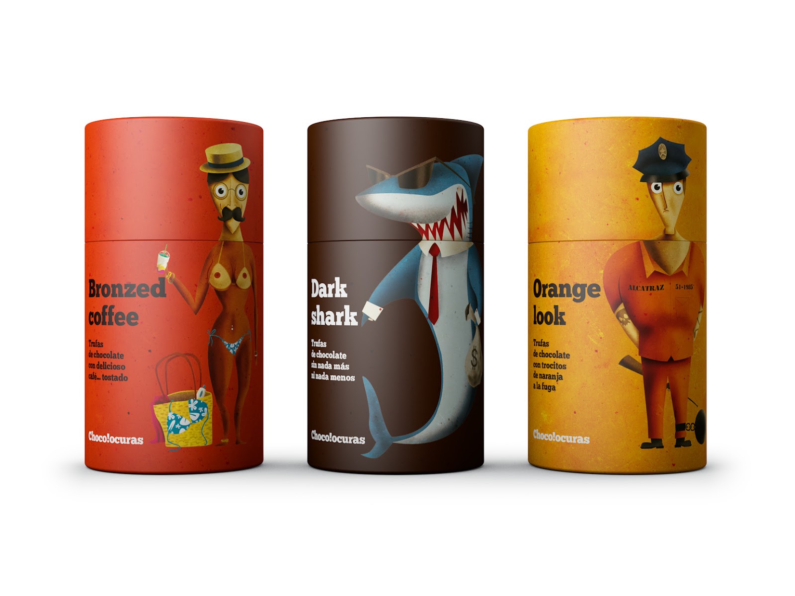
Chocolocuras: A Design That Changes Only If You Turn The Tap
Thief is the policeman, the lion is the hunter …? It’s a game, humor and fun. A design that changes only if you turn the tap. Two characters exchange their bodies and their heads to create a new and different one. The color use and the naming of each product give notoriety and presence at…

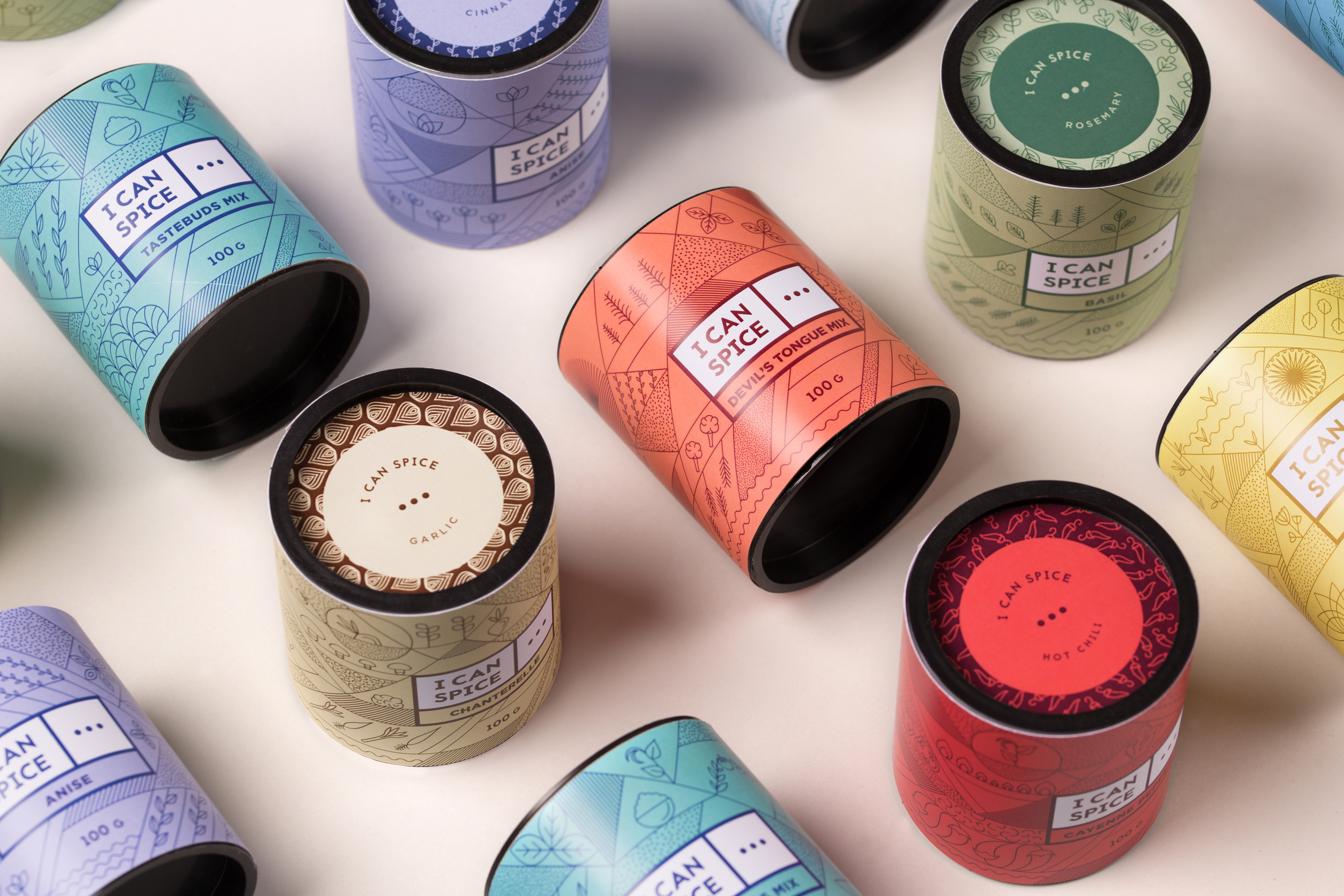
I Can Spice
I Can Spice is based on one simple yet brilliant idea: let’s make cooking a new, exciting experience for everyone. They offer a zillion types of premium spices from all around the world and special mixes for spicing your coffee or even your beer. Their goal is to encourage people to play and experiment more…

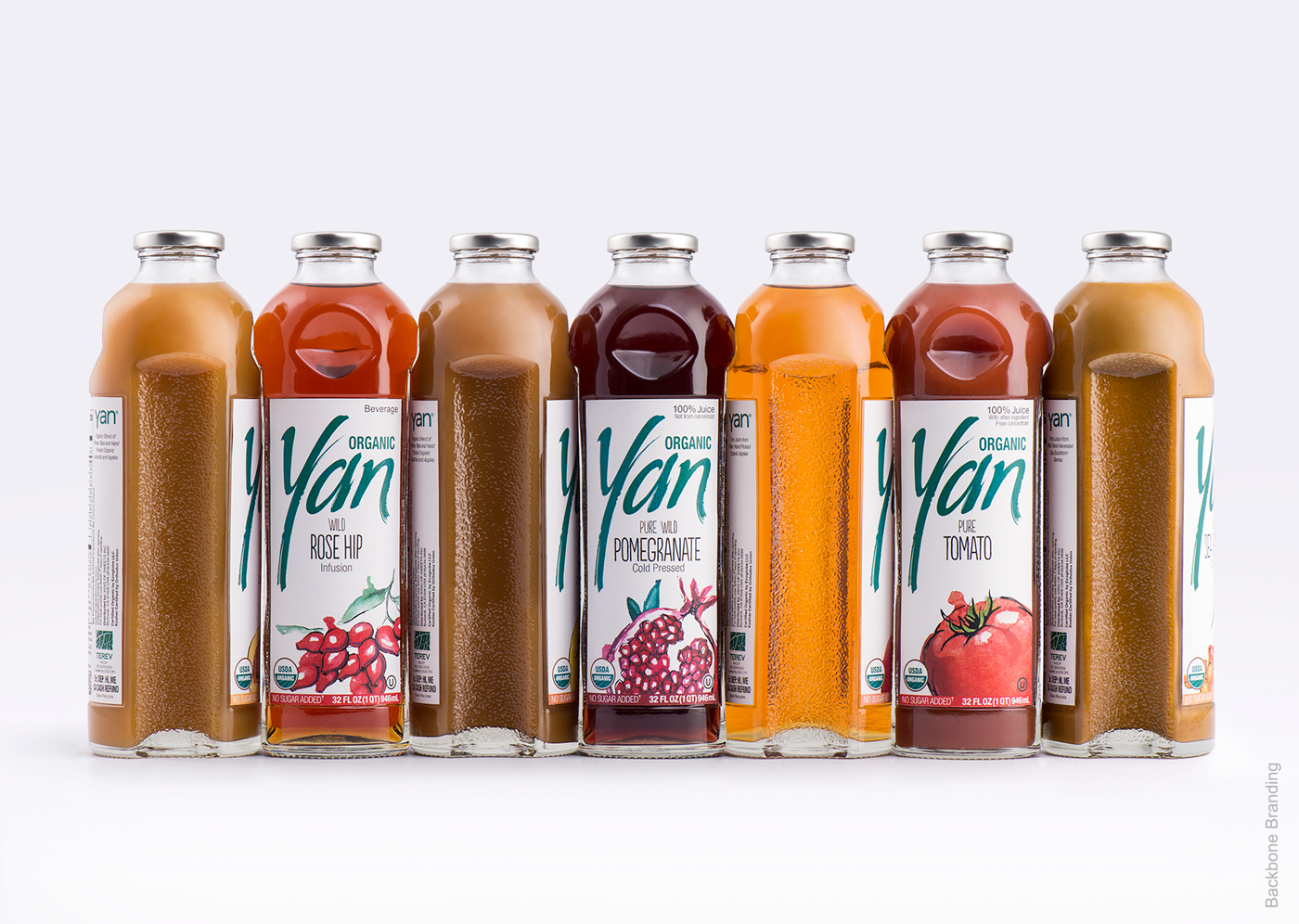
Yan’s Packaging Design
Backbone Branding’s collaboration with SIS Natural juice manufacturer started years ago, by developing a new juice branded YAN. As a result was developed a unique glass bottle which immediately put the product into premium category. The concept of the bottle was designed based on biomimicry principles: bitten apples put one after another which serve as…

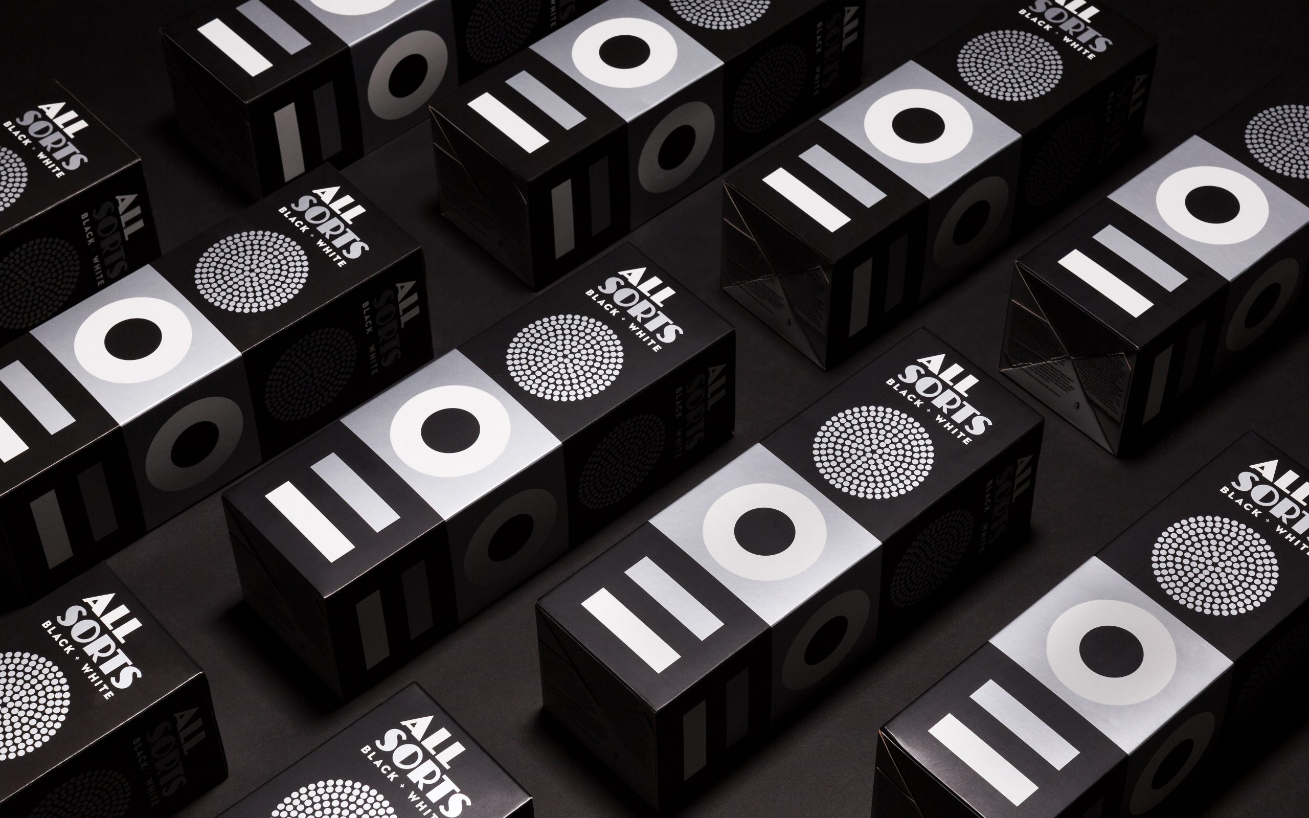
Allsorts Black and White Edition Packaging
What you see is what you get This packaging design of confectionary maker Cloetta’s Allsorts Black and White Edition follows the original’s lead, reflecting the colourless sweet content. The silver print and matt finishing give a tasty touch to the functional cardboard box. This packaging was brilliantly designed by Bond, a brand-driven creative agency located…

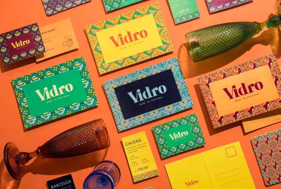
Vidro’s Colorful Packaging & Branding
Serious Studio created signature ornamental details for the brand, combining motifs from Portuguese culture with classic glass cut forms.
