Category: Editorial Design

Whiskey Sour Happy Hour
The Made Shop created these amazing posters, the key art and digital marketing materials for this special event.

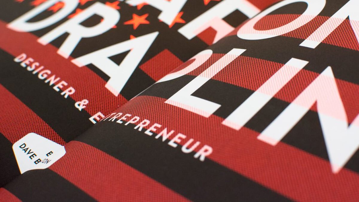
99U Quarterly — Issue 6
Ninety Nine U magazine tells the stories of creative leaders who are mastering their crafts, building incredible careers, and shaping their industries.

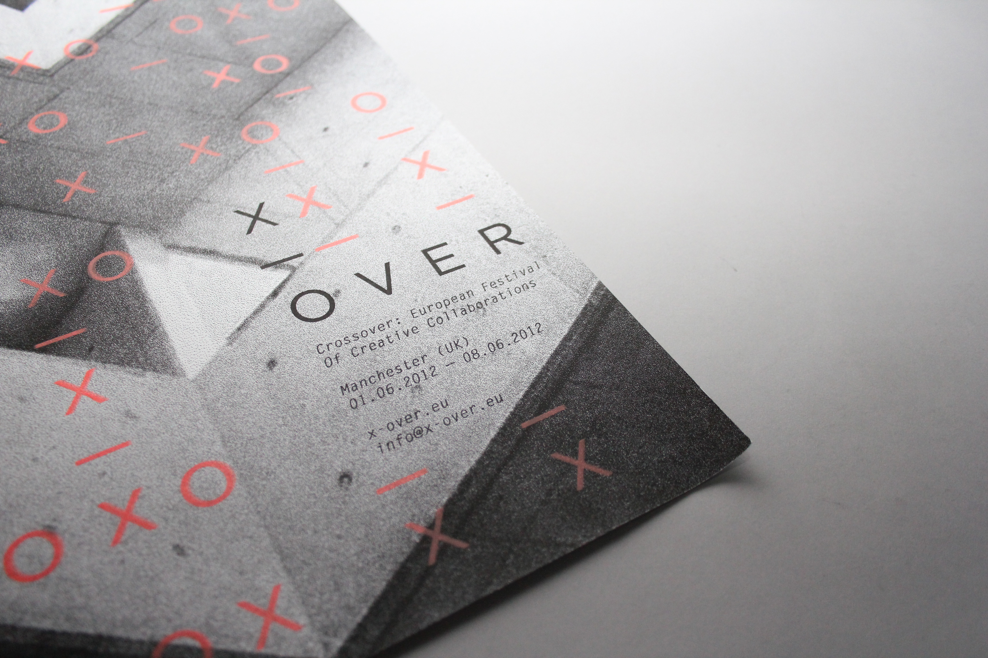
Crossover Festival: Branding & Promotion
A project developed by Jonathan Finch in collaboration with Stephanie Oglesby to brand and promote a new festival aimed at creative professionals. They have proposed that the festival would entail inviting creative practitioners from various fields and disciplines to collaborate and ‘crossover’ to create a piece of work that they wouldn’t normally. Thus, they named the…

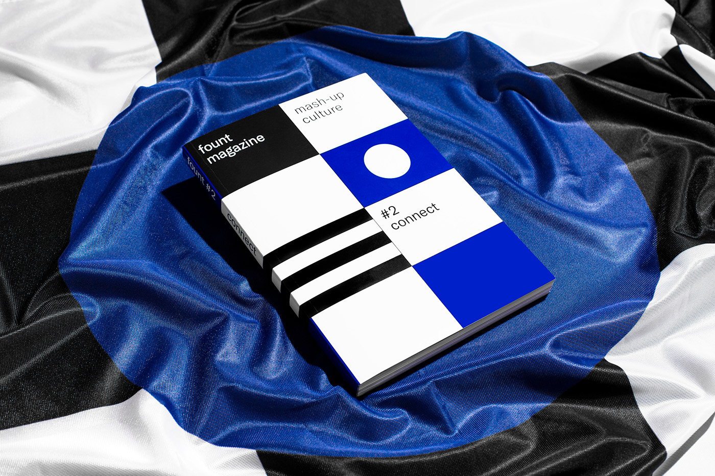
Fount Magazine #2 Connect
In his second issue, fount magazine examine what it means to “connect”. What does connection on an artistic level look like? In the category “mash-up” artists from around the globe came together in an open call to be inspired and to work together. Making connections is the foundation of fount magazine. They feature 60 artworks out of hundreds…

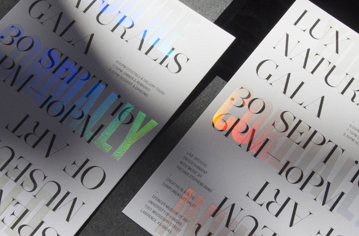
Lux Naturalis Gala Invitation
The Spencer Museum of Art explores the capacity of art to spark curiosity, inspire creativity and create connections among people. After major renovations to the museum, Design Ranch was asked to design the invitations for the grand re-opening gala, Lux Naturalis. Drawing inspiration from the new architecture and design, Design Ranch created an invitation that…

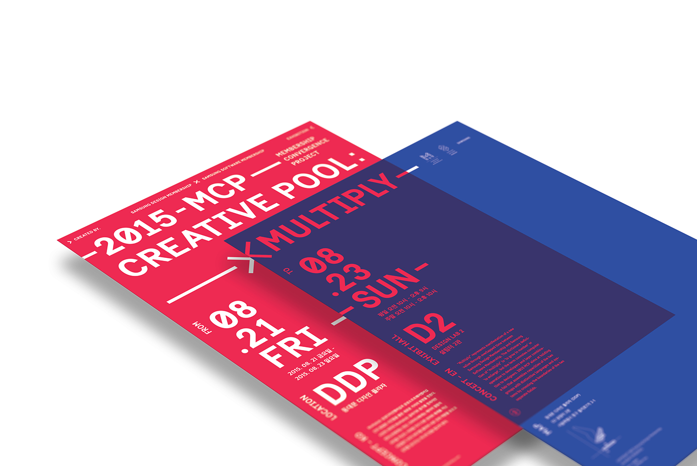
MCP – MULTIPLY Exhibition Identity Design
2015 Membership Convergence Project Exhibition – CREATIVE POOL : MULTIPLY “Multiply” conveys the manifestation of a new value through overlapped time between Samsung Design Membership and Samsung Software Membership. The dictionary definition of ‘multiply’ is ‘to grow in number’ or ‘to enlarge’, but the term connotes computer operation to developers and image layer blending to…

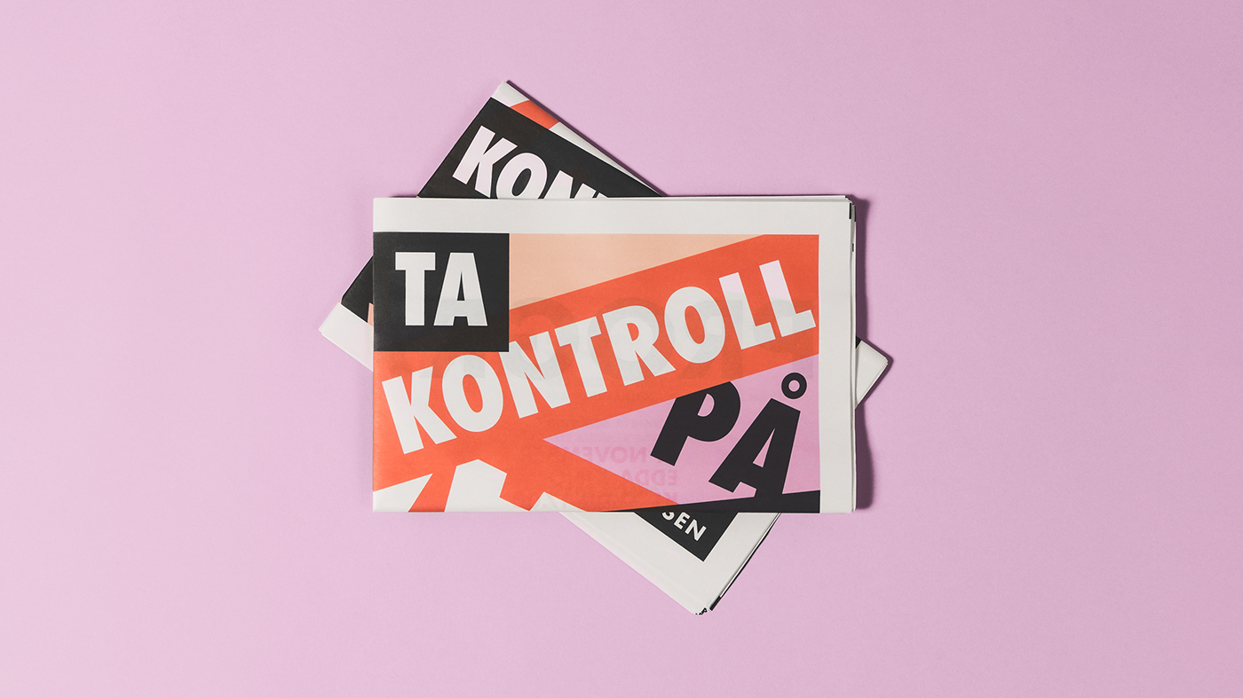
!Konferanse Visual Identity
!Konferansen is a new Norwegian conference for women, by women. The conference aims to provoke change and inspire growth—setting focus on strong women and their stories. The conference will consist of a series of lectures, debates and discussions. Larssen & Amaral were tasked with creating the new visual identity and marketing materials. Larssen & Amaral is…

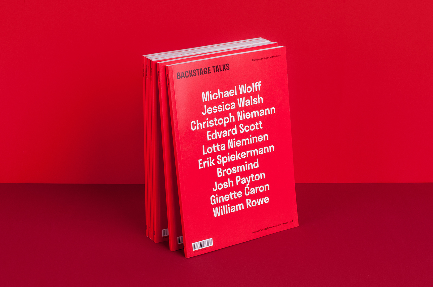
Backstage Talks Magazine
Being magazine lovers themselves, creating Backstage Talks was a delight and a major lesson for Milk. From the very beginning, They had a clear goal — to make Backstage Talks outstanding. From both editorial and design perspectives. Not exactly an easy task. The challenge for Milk was to craft the art direction in a way that will…

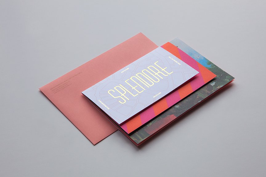
MBAM : Splendore a Venezia
This is an invitation to the Museum Ball, Splendore a Venezia, an annual event on behalf of the Volunteer Association of the Montreal Museum of Fine Arts, brilliantly designed by Pierre-Olivier Séguin, from Agence Tuxedo, Montréal, QC, Canada.

Heritage: A User’s Manual
‘Heritage: A User’s Manual’ was an exhibition at Southbank Centre’s Archive Studio, a temporary space situated in the Royal Festival Hall foyer. Bond designed a holistic visual identity for the exhibition. The stencil aesthetic of the letterform draws reference from the architectural elements and archival material from different eras, combined to represent one narrative for…

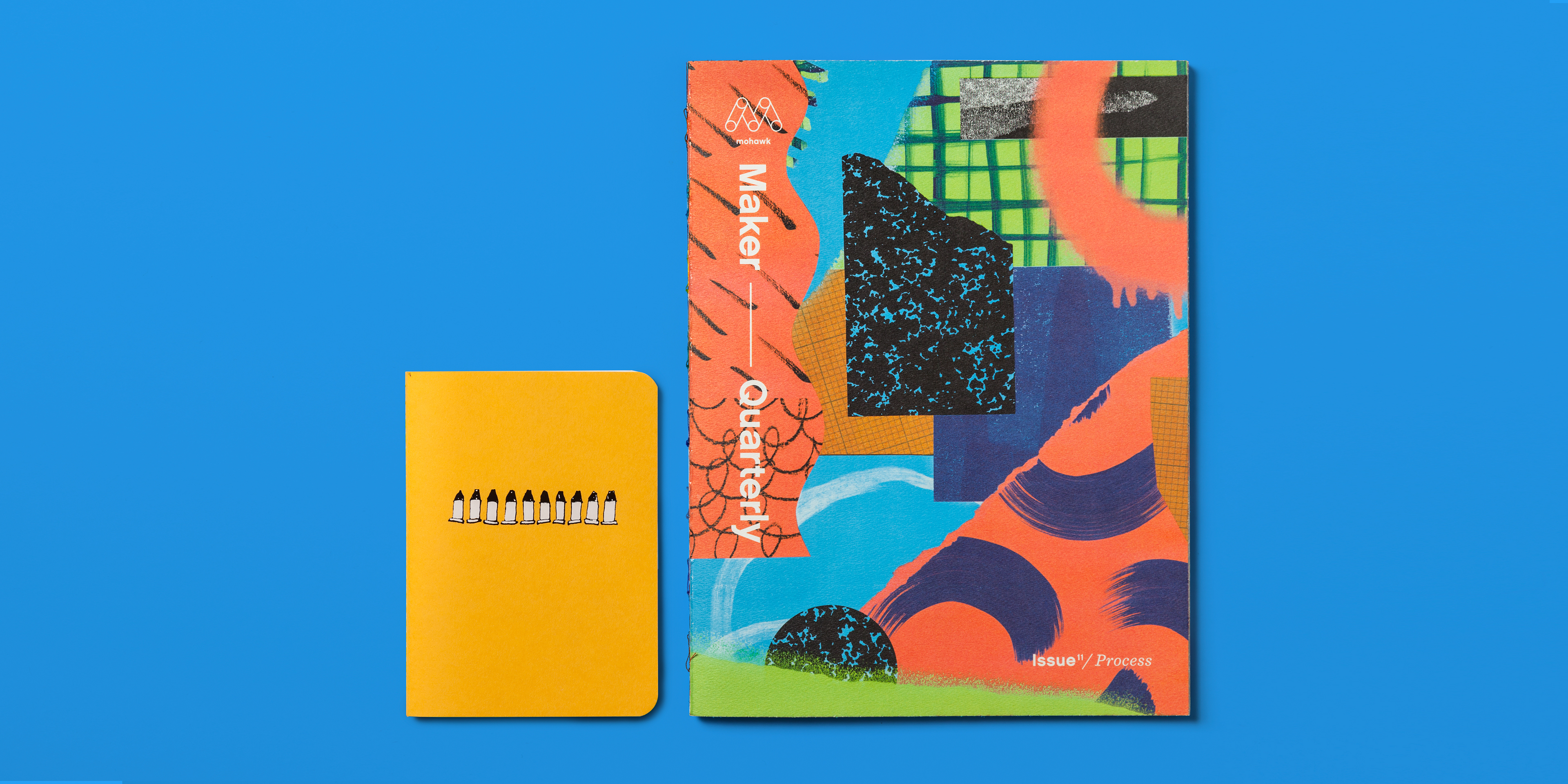
Mohawk Maker Quarterly 11: Process
The process of making something—method, materials, ingredients, artistry, experience—is the squiggly line between idea and object. In issue 11 of the Mohawk Maker Quarterly, Hybrid Design investigate the circuitous paths we take to get from Point A to Point B. An in-process character is evidenced in every tactile characteristic of the issue, from the sketchbook…
